
Unlike slides for a talk, training material includes pages where participants have to do something: activity instructions, role-play set-ups, reflection questions. Those are mainly where illustrations earn their place; adding a picture to every page of explanation does not improve understanding. Using a telephone skills session for new employees as the example, we build slides from this site's assets and compare placements.
Cover: put the text where the picture is empty
The cover sets the tone for the session, so a landscape picture spread across the whole slide works well. But text can only go where the picture has little detail. Decide where the text will go at the same time as you choose the full-bleed picture.

Activity instructions: show what the time is for before the words do
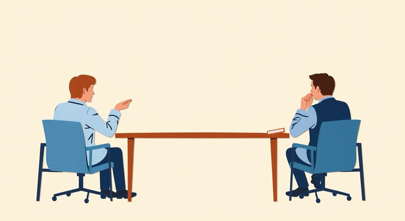
The instruction page for pair or group work is the first thing participants see when they look up. A picture of people facing each other in conversation tells them "this is time to talk" before they read a word. Keep the instructions short, and always state the time. Without knowing how many minutes the task takes, participants cannot pace themselves.
Explanation pages: choose to leave the picture out
On pages that explain steps or key points, a picture rarely helps understanding, and the space it takes shrinks the bullet points. The bullet points are what participants need to take away. Explanation pages read better built from text alone.
Role-play set-up: share the scene in one picture
In role-plays and case studies, everyone first needs to agree on where it happens, who is involved and what the situation is. One picture of the scene gets people there faster than three lines of text. Push the picture to one side and write the situation, roles and time on the other.
If the age or clothing of the people in the picture contradicts the set-up, participants are pulled towards the picture. Write the set-up first, then choose a picture that fits it.

Keep one style within a session
The examples in this article use assets in different styles, because the aim is to compare placements. In real material, if the cover, the activities and the role-play are each in a different style, every new page looks like it belongs to a different deck. Choose the pictures for one session from within a single style. How to match them is covered in “Why several illustrations in one document look mismatched”.
If you print and hand out the slides
When slides are printed in black and white as handouts, the boundary between a full-bleed picture and the text can become hard to see. If you plan to print and distribute them, use a full-bleed picture only on the cover, and set the other pages as text on a white background, and the layout will hold up. For how to decide the size and resolution of pictures, see “Adding illustrations to slides: size and placement”.