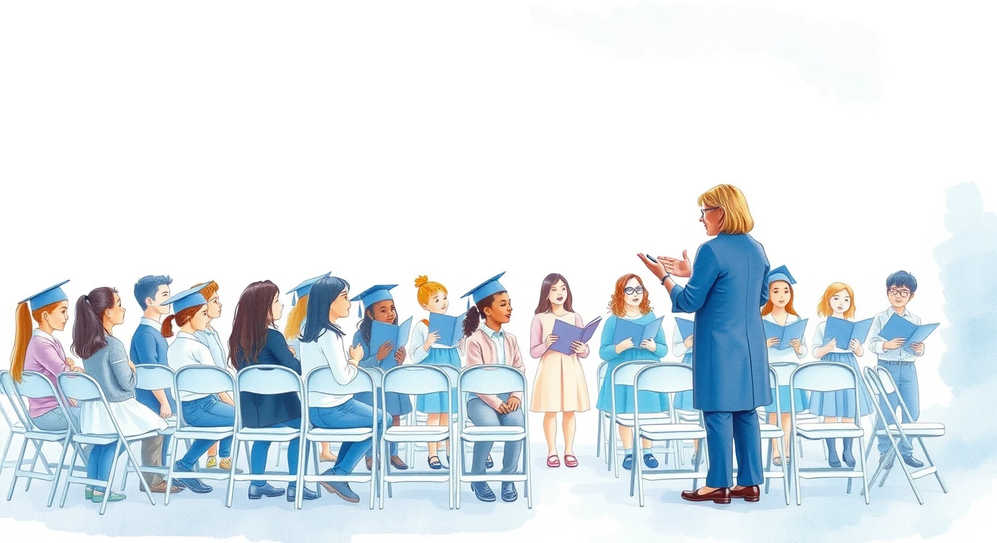
A class newsletter goes home in a child's school bag, gets stuck on the fridge, and is read by parents again and again. The illustration's job there is to show at a glance what this month's issue is about. Too large and it pushes the announcements aside; too small and it fails as a marker. Here are sample pages side by side, to sort out how to decide.
One large picture per issue
On an A4 page, use one large picture. For an event issue, a picture of the event; for any other issue, a seasonal picture. Give each of several topics its own large picture and more than half the page turns into pictures, pushing the announcements you want read down the page. Readers can no longer tell from the page which topic matters most this month, either.
Grade Newsletter: October Issue
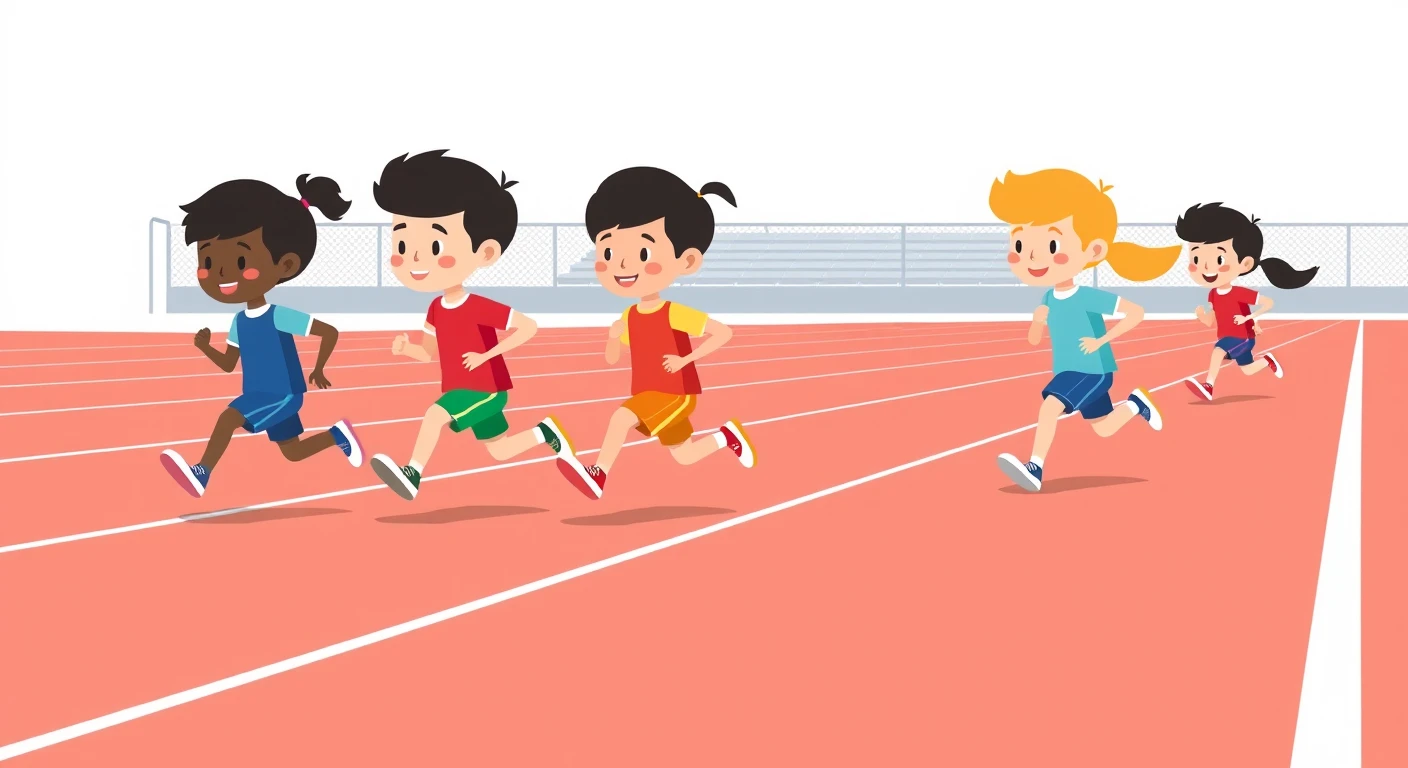
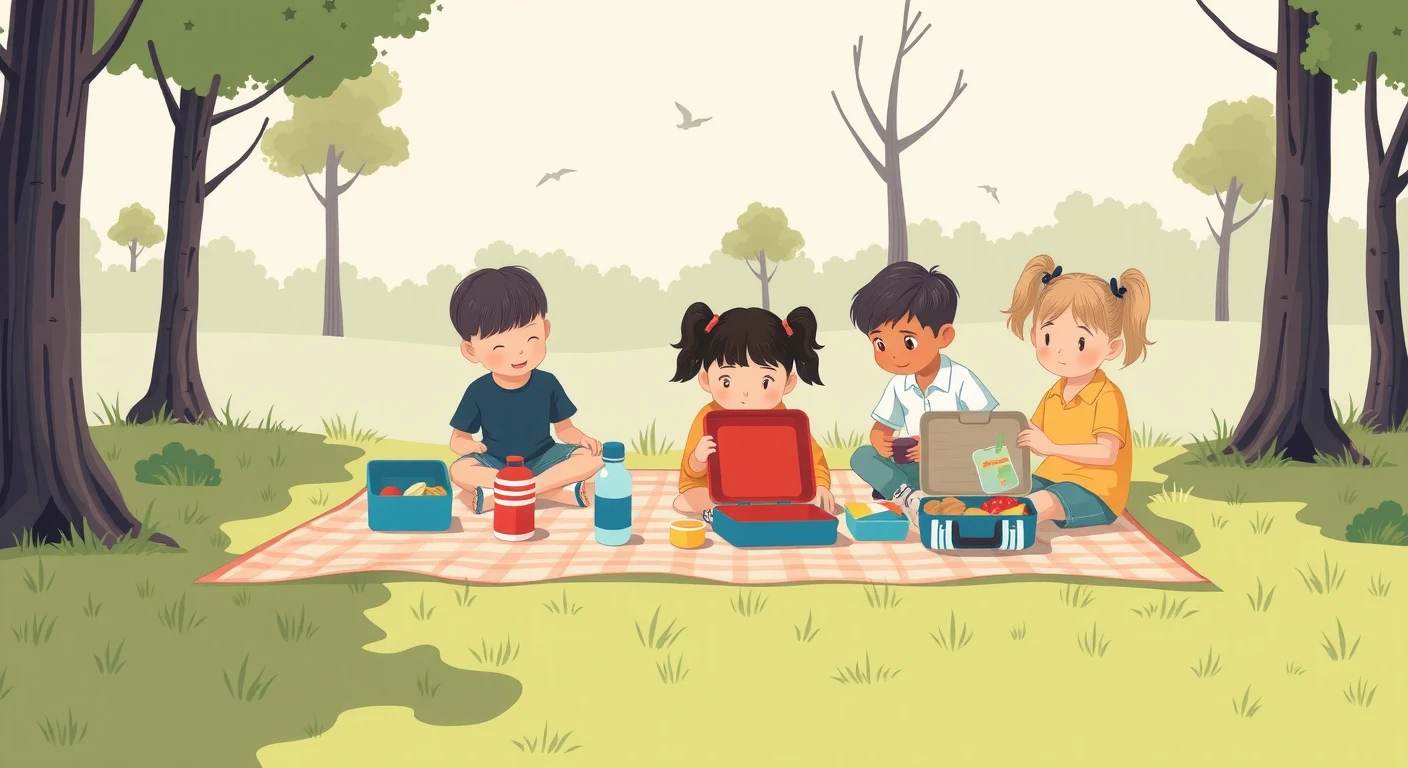
Grade Newsletter: October Issue
Sports Day
Field Trip Notice
Put it right under the heading, at full or half width
A landscape picture placed directly under the heading, at the same width as the text, takes up roughly the top third of the page and becomes the face of the issue. For an issue with many announcements, make the picture half width and push it to the top right, with the key points — the date, what to bring — listed on the left. With the key points level with the picture, the information people need catches the eye even from a distance, on a sheet stuck to the fridge.
What to avoid is dropping a picture into the middle of the text. It breaks the flow and leads readers to miss the announcements that continue below it.
Grade 1 Newsletter: Field Trip Issue
Date Wednesday, October 15
Destination Midori Park
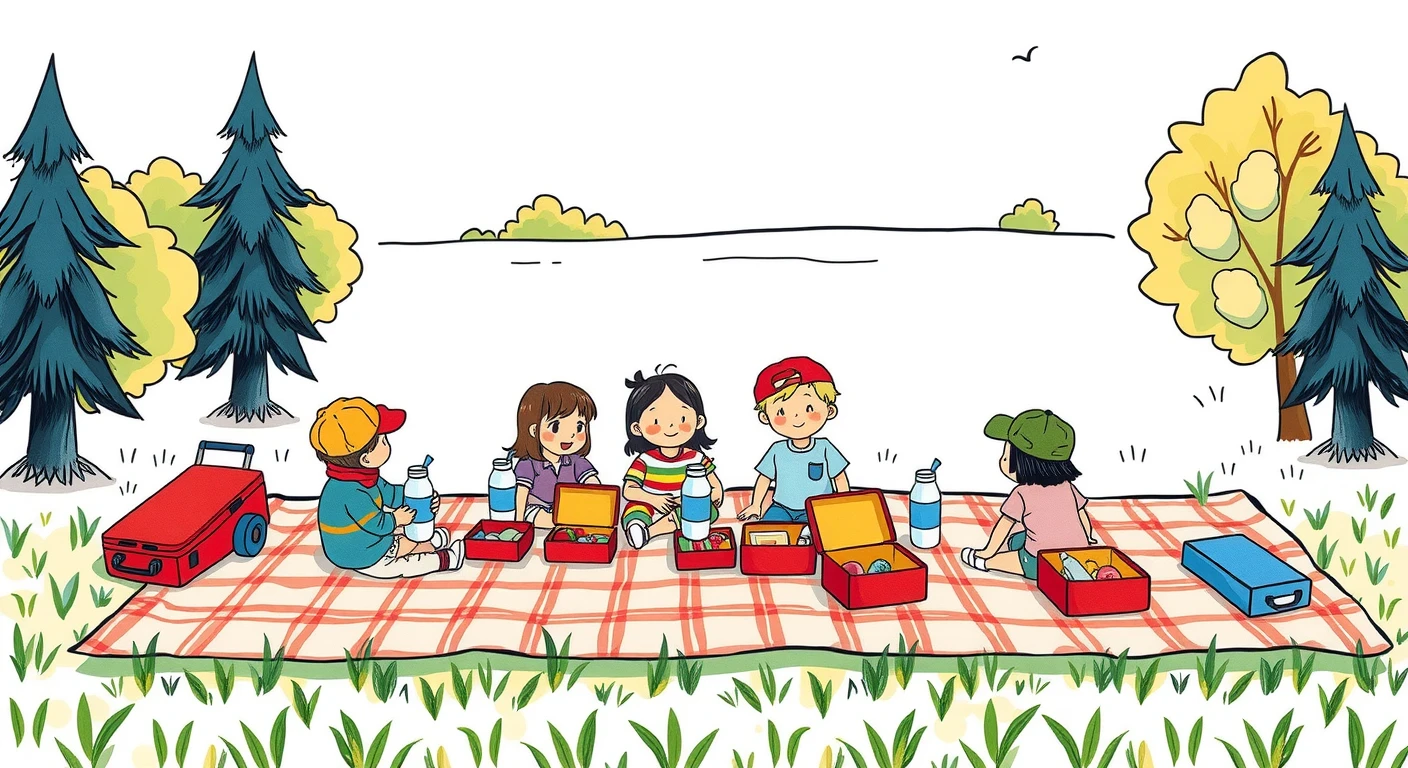
What to bring Packed lunch, water bottle, picnic blanket, rain gear
Decide after converting to black and white
Class newsletters are often printed in black and white. A picture chosen on a colour screen can lose its colour differences in black and white, until the figures can no longer be told apart from the background. The samples below were converted to black and white on screen. The actual print will vary with the printer or duplicator, but they show the tendency.
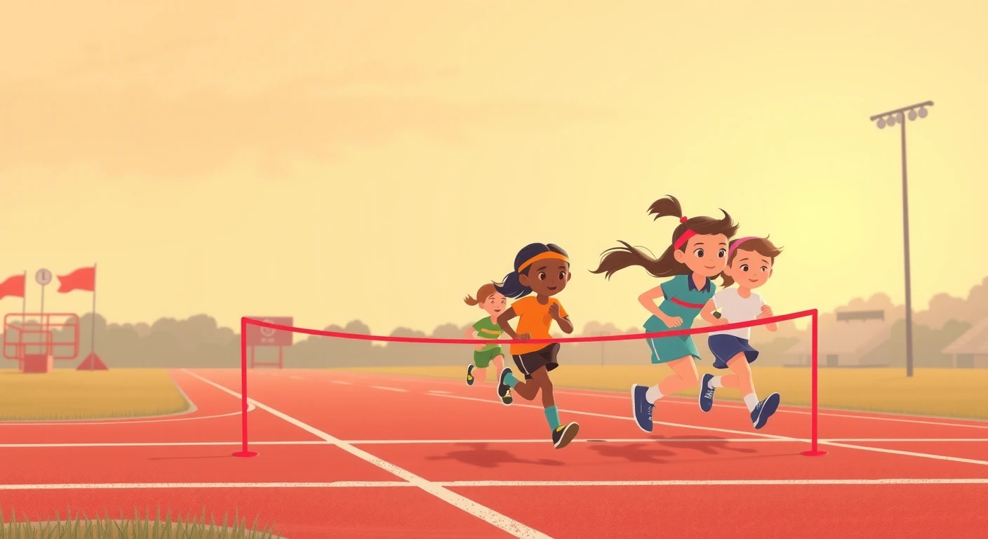
To check on a computer screen before choosing, use the "greyscale" option in image-editing software or a "black and white" preview in the printer settings. A single test print is also a sure way to find out.
Does the event picture match what your school looks like?
Readers compare an event picture with how things look at their own school. Where the two differ, the picture draws more attention than the content. These are the points worth checking.
- Graduation: check the picture against how your own school's ceremony actually looks. At Japanese elementary and junior high schools, for example, caps and gowns are not usual, so a picture with mortarboards reads there as a different kind of ceremony
- Sports day: schoolyard or gym, what the track looks like, headbands or caps
- Field trips and lunch: a packed-lunch day or a school-lunch day
- Clothing: a school with uniforms, or one where children wear their own clothes