
Tips
Commercial use of free assets, choosing image sizes, handling file formats — the points people most often get stuck on, explained.

 5 Things to Check Before Using Free Assets Commercially"Free" means free of charge, not free of rules. Here are the five things worth checking before you use a free asset in paid work, in the order people most often trip over them.
 What Size Should a Blog Featured Image Be?Base a featured image on 1200x630 pixels and it holds up when shared on social media. We lay crop frames over a real landscape image to see how much of it survives at that ratio and at others.
 Using Illustrations in School Newsletters and Public Sector DocumentsIllustrations are used constantly in class newsletters and public bulletins, but non-commercial does not mean unrestricted. How this differs from Article 35 of Japan's Copyright Act, which covers use in lessons, plus print use, distribution limits and other points that trip people up.
 What Is WebP? What to Do When a Downloaded Image Will Not OpenIf a .webp file will not open, here is what the format is for and how to convert it to PNG or JPG. You can also convert it right on this page, without the file being sent anywhere.
 Commercial Use of AI-Generated Illustrations (Our Position)Our assets are produced with image generation AI. Here is what official guidance has established, what tends to cause problems in practice, and the checks and withdrawals we carry out before and after publication.
 Do free illustrations need a credit line?Even where a site says no attribution is required, conditions may be attached. When a credit line is needed, with ready-to-use samples for web pages, slides, print and social media.
 Adding illustrations to slides: size and resolutionSlides are not blogs or print. Looking at size alone: the resolution you need, what happens when you stretch an image out of proportion, and the file size before you share the deck.
 YouTube thumbnail size, and how much text fitsThe specifications in YouTube Help, such as recommended size and format, and how to keep a thumbnail readable when it is shown small, checked by laying out the same thumbnail at the sizes it actually appears.
 Making icons look consistent in a documentAn icon carries meaning on its own, so one in a different style reads as emphasis. How to match fills and outlines, enclosing shapes, size and colour, compared using real rows of icons.
 Choose a profile picture by how it looks smallA profile picture is chosen at one size and seen at another. We show the same images small and cropped to circles and rounded squares, to compare the points worth checking before you choose.
 Why several illustrations in one document look mismatchedEach one looks fine alone, then the set falls apart. The cause is not taste — specific things are out of step. Comparing a mixed row with a matched one, here they are in the order worth matching them.
 Choosing illustrations for hiring and interview materialIllustrations in hiring material can narrow your audience unintentionally. A selection question, not a rights one: who is depicted, how roles are drawn, dress, and online interviews.
 What to write in the alt text for a stock imageIt is not always obvious what to put in alt when you place a downloaded asset on your site. We use one picture in three placements and set suitable and unsuitable alt text side by side, to show how to decide.
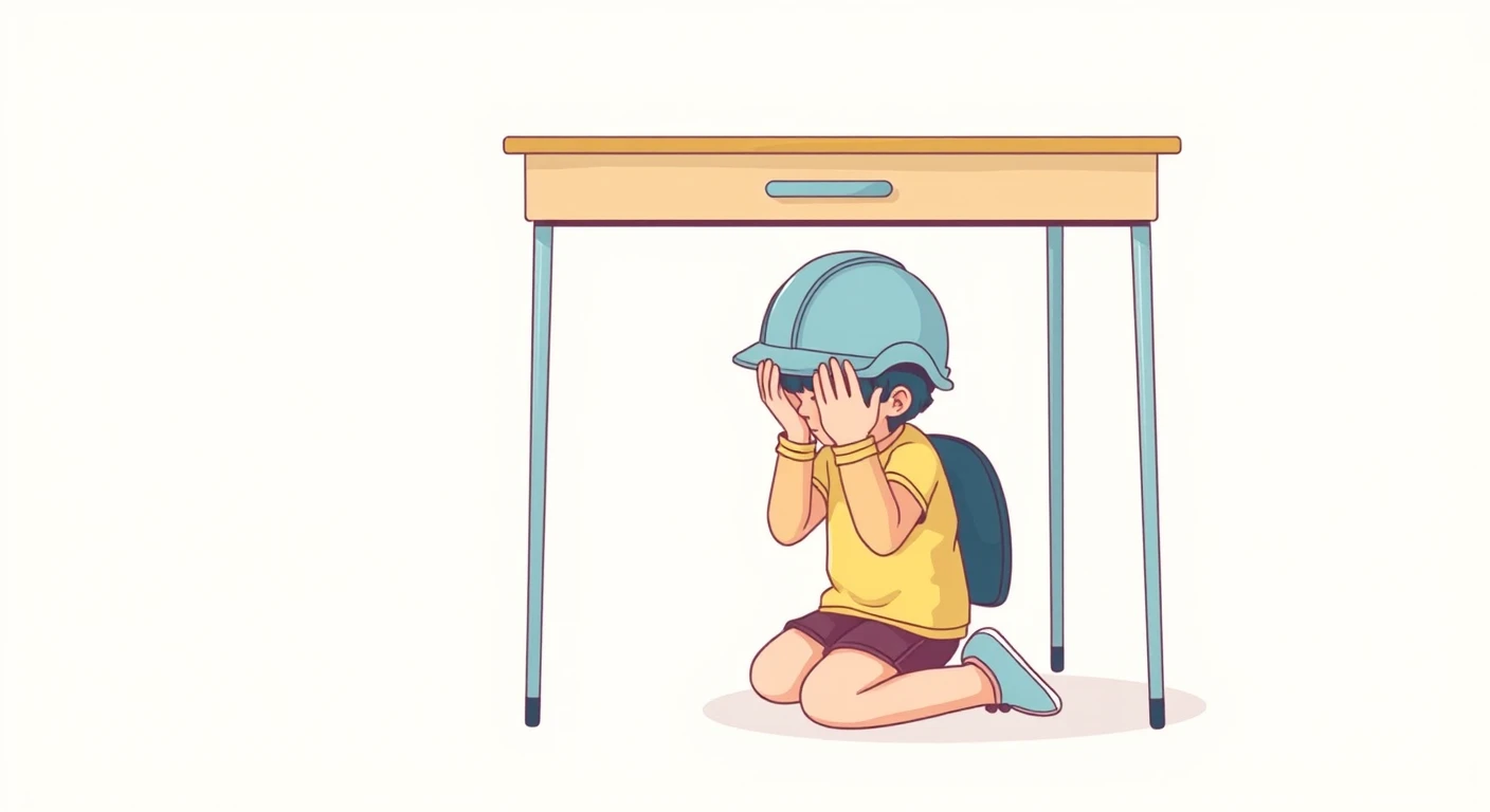 Choosing evacuation drill illustrations by the actions they showChildren take the picture on an evacuation drill notice as a model of what to do. Based on Japanese government guidance: what earthquake and fire drill pictures should show, and how to make the text agree with them.
 Is the picture on your cooking class worksheet a good model for getting ready?Children take the picture on a cooking class worksheet as a model for getting ready. Based on a Japanese home economics hygiene guidebook: aprons, head scarves, hair and sleeves, and keeping mood pictures apart from how-to ones.
 Illustrations in training slides work best on the right pagesIn-house training slides do not need an illustration on every page. Using sample slides, we compare the pages where a picture helps — the cover, activity instructions, role-play set-ups — with those better left without.
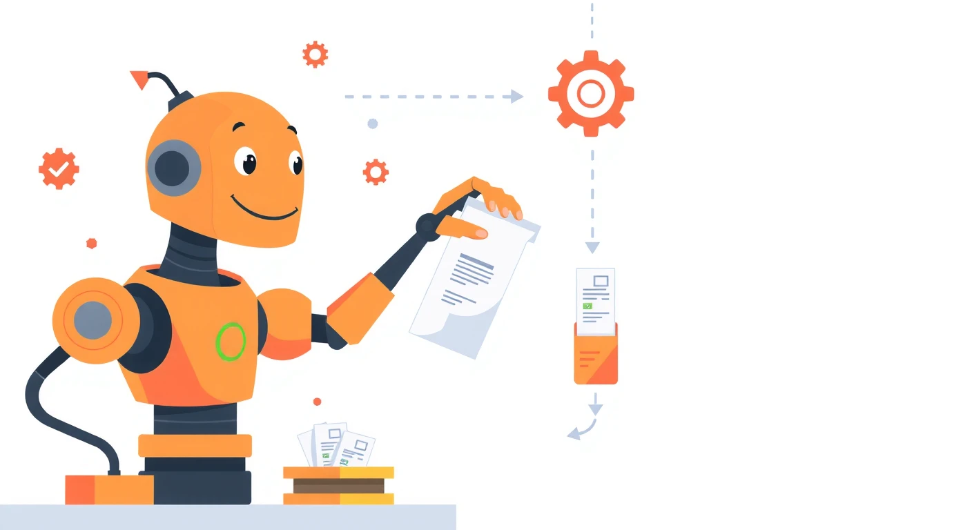 Choosing AI, cloud and data illustrations by what they end up sayingPictures of intangible technology make claims of their own: a robot says autonomy, a human head says thinking, a rising line says growth. For each common metaphor, examples of where it fits and where it does not.
 Illustrations in class newsletters: deciding size and placementThe size and placement of illustrations decide how readable a class newsletter is. Sample pages show how many big pictures to use, where to put them, how they print in black and white, and whether event pictures fit your school.